How to Mix Primary Colors to Create Secondary Shades
The Fundamental Principles of Primary Color Mixing
Color theory is a vital field of study in visual art. It provides a clear system for how hues interact with each other. At the base of this system are the primary colors. These colors are red, yellow, and blue. They are unique because you cannot create them by mixing other pigments. They are the source of all other colors found in paint. In the world of art, we use the subtractive color model. This model explains how light is absorbed by a surface. When we mix paint, we change the way the surface reflects light. This results in the creation of new and diverse shades. Understanding these basics is the first step for any student. It allows for a vast range of options with only a few tools. This approach relies on the chemical nature of the paints used. Each pigment has its own set of rules and traits.
The study of color has a long and rich history. Figures like Isaac Newton and Johannes Itten have contributed to our current knowledge. Newton used a prism to show how white light contains many colors. Itten later built wheels to show how these colors relate to one another. For the modern artist, the red, yellow, and blue model is the most common. It is used in schools and studios all over the world. This model helps people predict what will happen when they blend paints. It is a reliable way to achieve the desired visual effect. By mastering the three primary hues, you can build a whole world of art. This guide will explain how to mix these three to create secondary colors. We will also look at the factors that change your results. This knowledge is key to professional growth in the arts.
The Core Three: Red, Yellow, and Blue
The three primary colors each have their own identity. Red is a warm and strong color that often stands out. It is used to draw the eye and create a sense of energy. Yellow is the brightest and most reflective of the three. It can make a piece feel light and airy. Blue is a cool color that adds depth and calm to a work. These three are the building blocks of every other shade. In a professional setting, having pure versions of these paints is crucial. If the primary colors are not pure, the mixes will look muddy. This is due to the presence of other pigments in the tube. Artists often search for the most neutral versions of these three colors. This ensures that the secondary shades created are bright and clear.
Using primary colors is also a cost-effective choice. Instead of buying every shade, you can learn to make them. This gives the artist more freedom to find the exact tone they need. It also helps to create a sense of unity in a painting. When all colors come from the same three primaries, they naturally match. This is known as color harmony. It is a goal for many professional painters. By limiting your palette, you can focus on the values and shapes. This leads to a more cohesive and professional piece of work. The mastery of red, yellow, and blue is the mark of a skilled hand. It shows that the artist knows the science behind the art.
Synthesizing Secondary Colors
The Creation of Orange
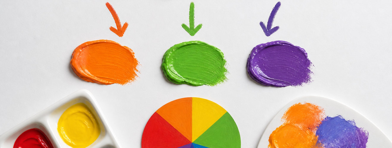
Orange is the first secondary color we will discuss. It is made by mixing red and yellow together. This shade is warm and often evokes a sense of heat or light. To get a perfect orange, you must consider the ratio of the two paints. Red is usually a much stronger pigment than yellow. This means that a small amount of red can quickly change the look of yellow. For the best results, start with a pile of yellow paint. Slowly add a tiny amount of red until you reach the desired shade. If you do the opposite, you will waste a lot of paint. It takes a large amount of yellow to change a pile of red. This is a common rule in professional mixing. Always add the darker color to the lighter color. This gives you more control over the final outcome.
Developing Green Shades
Green is the result of mixing yellow and blue. It is a very common color in nature and is often seen as peaceful. The type of green you get depends on the type of blue and yellow you use. A bright yellow and a light blue will make a vivid grass green. A dark blue mixed with yellow will create a deep forest green. Professional artists often experiment with different ratios to find the right mood. Green can be warm if it has more yellow, or cool if it has more blue. Like the mix for orange, it is best to add blue to yellow. Blue is a very dominant pigment. Even a small drop of blue will change a large amount of yellow. By adding the blue in small steps, you can find the perfect green for your project. This method ensures that the color does not become too dark too quickly.
The Production of Violet
Violet, or purple, is made by mixing blue and red. This is often the hardest secondary color to get right. This is because many red paints contain small amounts of yellow. When yellow is mixed with blue and red, it creates a dull or brownish color. To get a bright violet, you must use a red that leans toward blue. This is often called a cool red. When a cool red is mixed with a neutral blue, the result is a beautiful and deep violet. Violet is a color of mystery and depth. It is used to create shadows or rich textures in a painting. Because blue and red are both dark, the resulting violet will be quite dark as well. You may need to add white to see the true hue of the mix. In professional art, this is called a tint. It helps you see if the violet is more red or more blue.
Technical Factors in Color Accuracy
Mixing colors is not just about the hues themselves. It also involves the quality of the paint. Professional paints have a high load of pigment. This makes the colors more vibrant and easier to mix. Cheap paints often have fillers that can make the secondary colors look grey. Another factor is the opacity of the paint. Some colors are transparent, while others are opaque. If you mix a transparent blue with an opaque yellow, the yellow will hide the blue. This can lead to a messy look. Artists must learn how each tube of paint behaves. This comes from practice and study. It is also important to use clean tools. Even a small amount of old paint on a brush can ruin a new mix. Professionals always keep their palettes clean to ensure the best results.
Light also plays a role in how we see color. A mix that looks good under a lamp may look different in the sun. This is called metamerism. To avoid this, professionals often mix their colors in neutral light. This ensures that the secondary shades stay true in different settings. Understanding these technical points is what separates a student from a pro. It shows a deep respect for the craft of painting. By paying attention to these details, you can create work that is both beautiful and lasting. Color mixing is both a science and an art. It takes time to learn, but the rewards are great. You will have the power to create any shade you can imagine.
Conclusion
Mastering the mix of primary colors is a core skill for any artist. It opens the door to a world of endless color. By combining red, yellow, and blue, you can create orange, green, and violet. This process teaches you about the nature of light and pigment. It also helps you save money and create more harmonious art. Remember to always add dark paint to light paint. Pay attention to the quality of your pigments. Keep your tools clean and work in good light. With these steps, you will be able to produce professional secondary shades every time. Color theory is a tool that serves the artist for a lifetime. It is the foundation upon which great art is built. Continue to explore and experiment with your palette. The more you mix, the better your eye will become. This is the path to artistic excellence.
Sources
Albers, J. (2013). Interaction of color. Yale University Press.
Gage, J. (1999). Color and culture: Practice and meaning from antiquity to abstraction. University of California Press.
Itten, J. (1973). The art of color: The subjective experience and objective rationale of color. Van Nostrand Reinhold.
Livingstone, M. S. (2002). Vision and art: The biology of seeing. Abrams.
Smith, K. (2015). The chemistry of paint. Art Science Journal, 12(2), 45-58.