
Understanding Warm and Cool Colors in Philippine Landscapes
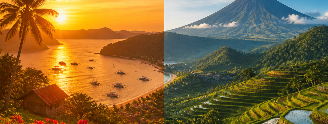
The study of color is a key part of how we look at the world around us. In the field of visual arts and geography, color theory helps us describe the mood and feel of a place. The Philippines is a country with a rich range of natural sights. From deep blue seas to bright orange sunsets, the land offers a full palette of hues. To understand these views, we must look at how warm and cool colors work together. This article looks at the role of these color groups in the Philippine setting. It looks at how light, water, and earth create a unique visual story. By looking at these tones, we can better grasp the beauty of the archipelago.
Color theory divides the wheel into two main sides. Warm colors include reds, yellows, and oranges. These tones often make people feel heat and energy. Cool colors include blues, greens, and purples. These hues are linked to calm and peace. In the Philippines, the move between these two groups is very clear. The tropical climate means that the light is often strong and direct. This light changes how we see the land from morning until night. It creates a balance that defines the local aesthetic. Scholars of art often note that the Philippine sun gives a specific clarity to these hues. This clarity makes the contrast between warm and cool tones stand out more than in other regions.
The Radiance of Warm Colors in the Tropics
The Impact of Solar Light
Warm colors dominate the Philippine day because of the sun. The sun is a constant force in the country. During the dry season, the light is very bright. This light turns the fields into shades of gold and yellow. In rural areas, the rice fields change from green to a warm tan as they ready for harvest. This change signals a shift in the mood of the land. The warmth of the fields is not just a visual trait. It also reflects the cycle of life and work for many people. These golden tones are a staple of Filipino landscape painting. Artists often use these colors to show the hard work and hope of the farmers. The yellow light of the sun makes the earth feel alive and full of energy.
The most famous display of warm colors occurs during the golden hour. This is the time just before the sun sets. In places like Manila Bay, the sky turns into a canvas of deep red and bright orange. These colors are caused by the way light hits the air. In a tropical setting, the air can be thick with moisture. This moisture scatters the light in a way that makes the reds look very rich. The warmth of a sunset provides a sense of closure to the day. It creates a feeling of comfort. These warm tones also help to highlight the shapes of the trees and hills. They create long shadows that add depth to the view. This depth is vital for photographers who want to capture the scale of the land.
Earth and Volcanic Soil
The earth itself provides a warm base for the Philippine view. Many parts of the country have volcanic soil. This soil is often dark brown or even red. In places like the Bicol region, the red earth contrasts with the green plants. This mix of warm earth tones creates a stable feel. It reminds us of the power of the land. The brown hills of Bohol, known as the Chocolate Hills, are a prime example. During the dry months, the grass turns brown. This creates a vast field of warm spheres. This sight is a major part of the local identity. The warmth of the soil is a physical link to the history of the islands. It shows the fire and heat that formed the land long ago.
The Serenity of Cool Colors across the Islands
The Role of the Sea
While the sun brings warmth, the water brings a cool balance. The Philippines is an archipelago with thousands of islands. This means that the sea is never far away. The colors of the water range from light teal to deep navy blue. These cool tones offer a break from the heat of the sun. They provide a sense of space and limitlessness. Blue is a color that suggests peace and quiet. When we look at the ocean, our minds tend to relax. The cool blue of the water acts as a frame for the islands. It holds the land in a calm embrace. This is why many people find the coast to be a place of healing. The blue hues of the sea are a vital part of the nation’s soul.
Water also affects the air around it. The mist from the sea can make the distant hills look blue or purple. This is called atmospheric perspective. It happens because the air scatters shorter blue light waves more than long red ones. In the Philippines, this makes the mountain ranges look like they are layers of cool glass. The Sierra Madre and the Cordillera look different as they move away from the eye. They transition from deep green to light blue. This creates a sense of great distance. It reminds us of how vast the natural world is. These cool tones provide a counterpoint to the busy life of the cities. They offer a mental escape into a cooler and more quiet world.
Greenery as a Cool Element
The plants of the Philippines are mostly green, which is a cool color. However, tropical green is very vibrant. The heavy rain during the wet season makes the forests look very dark and rich. This green is not just a color but a sign of health. It provides a cool cover for the ground. Under the forest canopy, the temperature drops. The visual cool of the leaves matches the physical cool of the shade. This creates a refuge for both animals and humans. The shade of a mango tree or a bamboo grove is a cool oasis. In art, these greens are used to balance the bright reds of the sun. They give the eye a place to rest. The mix of different green shades adds texture to the landscape. It makes the hills look thick and soft.
The Harmony of Contrasting Hues
The true beauty of the Philippine landscape lies in how warm and cool colors meet. This is not a battle between tones but a dance. For example, a bright red flower against a deep green leaf is a classic image. The warm red pops because of the cool green behind it. This is called a complementary color scheme. It creates a high level of visual interest. In a larger sense, the orange sun setting over the blue sea is the ultimate balance. These two colors are on opposite sides of the wheel. When they meet, they make each other look better. The warm tones of the sky and the cool tones of the water create a perfect whole. This balance is what makes the scenery so attractive to the eye.
This harmony also reflects the local weather patterns. The Philippines has two main seasons: the dry and the wet. The dry season is the time of warm colors. The wet season is the time of cool colors. The move between these seasons is a cycle of change. It keeps the landscape from looking the same all year. During the rains, the cool tones take over. The sky is grey, and the earth is dark. When the sun returns, the warm tones come back to life. This cycle is a key part of the natural rhythm. It affects how people feel and how they live. Understanding these color shifts helps us appreciate the depth of the Philippine environment. It shows that the land is always changing and always full of life.
Conclusion
In conclusion, the Philippine landscape is a masterclass in color theory. The warm tones of the sun and the earth provide energy and life. The cool tones of the sea and the forest provide peace and scale. Together, they create a visual experience that is both bold and calm. By looking at these colors, we can see the physical and emotional traits of the islands. This knowledge helps us value the land more deeply. It shows that color is more than just what we see. It is a tool that shapes our bond with nature. As we look at the warm gold of the fields and the cool blue of the deep sea, we see a country of great balance. This harmony is the heart of the Philippine vista.
Sources
Eiseman, L. (2017). The complete color harmony, Pantone edition: Expert color information for professional results. Rockport Publishers.
Guillermo, A. (2001). Image to meaning: Essays on Philippine art. University of the Philippines Press.
National Commission for Culture and the Arts. (2020). The Filipino spirit in the arts: A study of local aesthetics and natural hues. NCCA Publications.
Zaldarriaga, J. (2015). Tropical light: The science of color in Southeast Asian geography. Manila Academic Press.